Brand Strategy and Design
Bebop Small Batch Ice Cream
Project Scope:
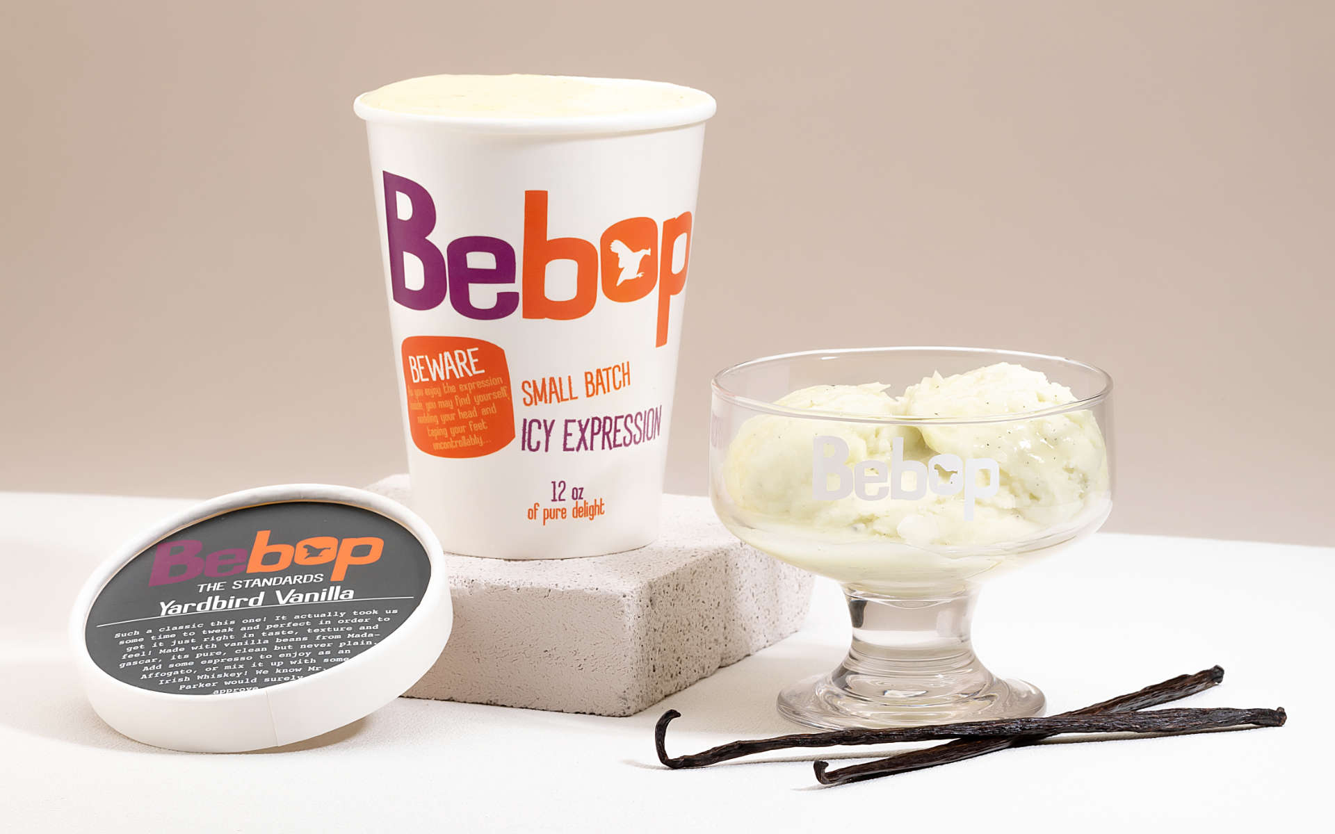
Bebop田鳥香草
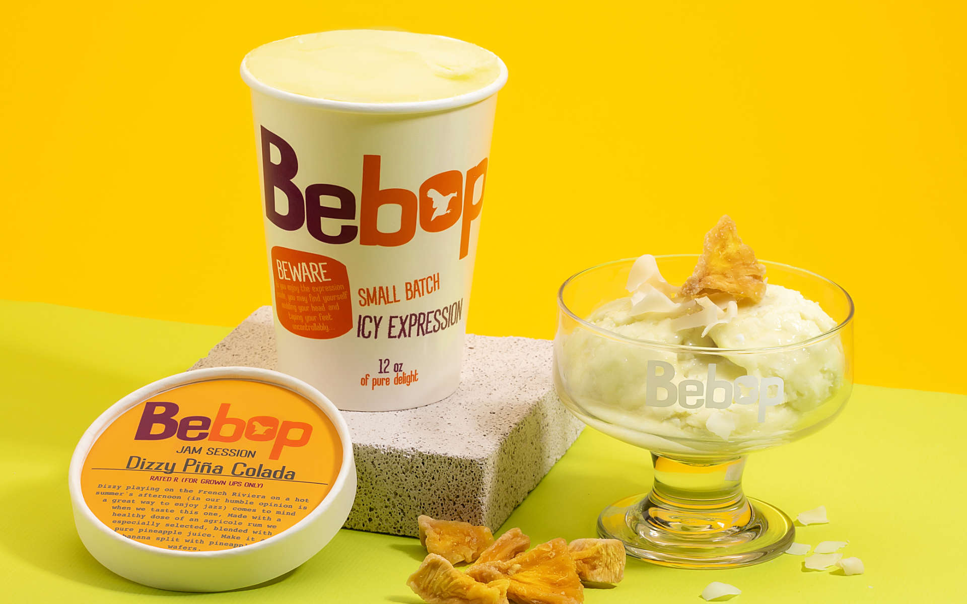
Bebop的包裝充滿了介紹品牌的文案,想說這個是我們接觸想要更多認識Bebop的人最好的方式 / The Bebop packaging is filled with copy, we felt the best way to communicate to those who care to know a little more.
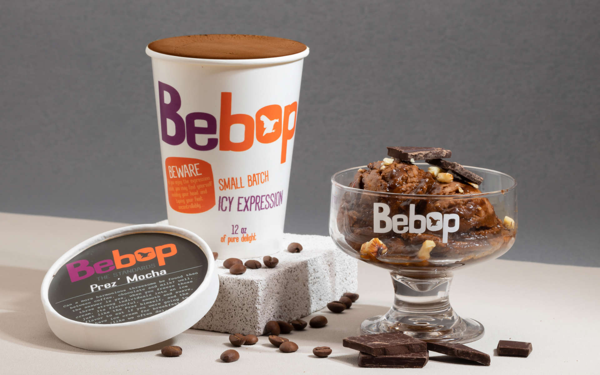
Bebop總統摩卡
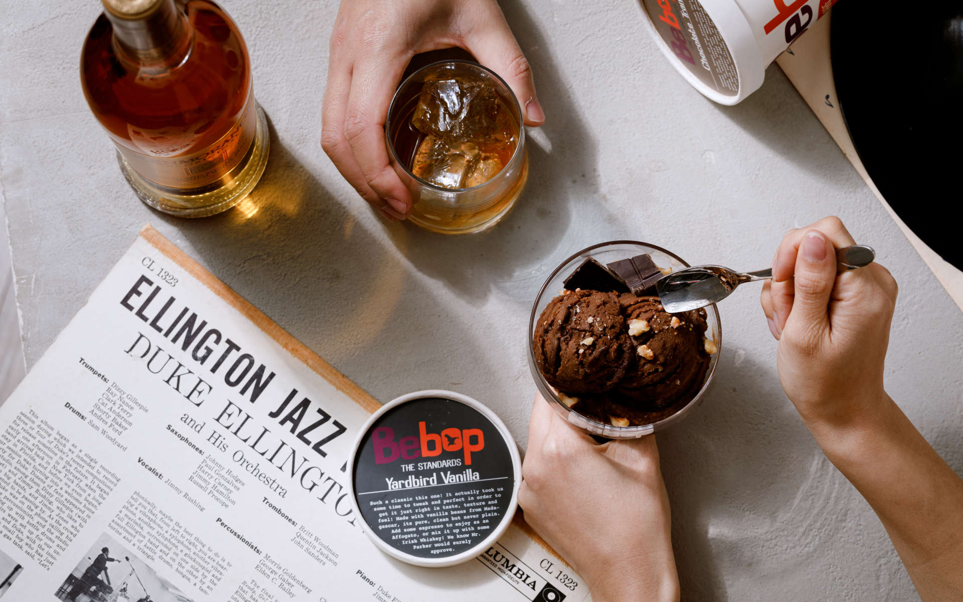
Bebop’s fun flavor name are all inspired by Jazz musicians. Bebop趣味的口味名稱的靈感都是爵士樂手
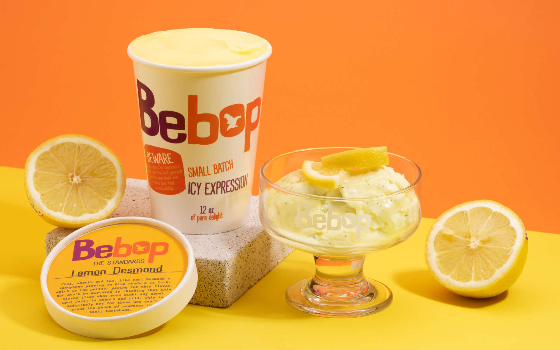
Bebop鑽石檸檬
Bebop的冰淇淋用顏色的方式溝通口味,整體的包裝呈現一種好玩的感覺 / Bebop’s packaging uses bold colors to get across flavor and make it fun
Bebop微醺鳳梨可樂達
微醺的口味的杯蓋都有一個酒杯,傳遞這個口味有酒 / The alcoholic flavors all have the icon of a glass to showcase that there is alcohol inside.
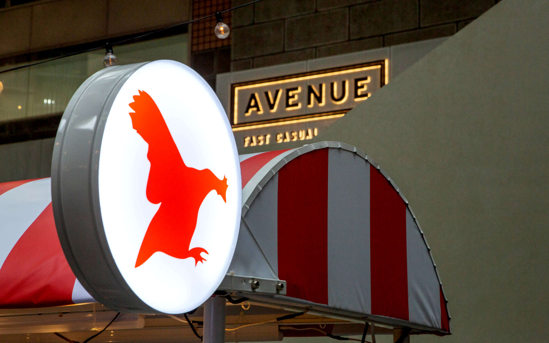
Bebop圖形標誌
Bebop的圖形標誌是一支會飛的田鳥(公雞),為了紀念爵士樂手查利·帕克 / Bebop’s logo is of a flying yardbird, in honor of the great Charlie Parker
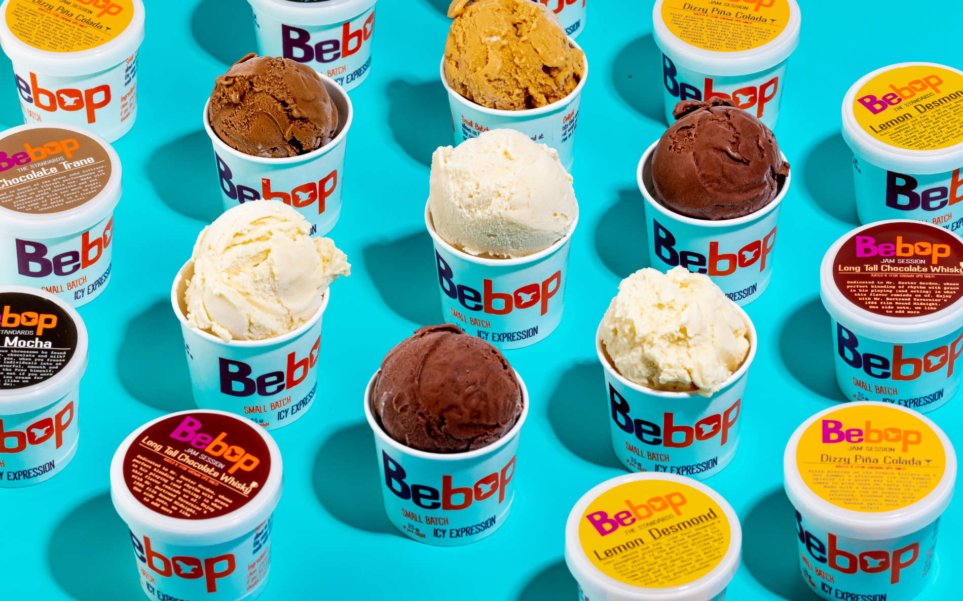
Bebop 3.5oz小杯包裝
Bebop小杯包裝上市時所使用的圖片 / Image for communicating Bebop’s 3.5 oz packaging.
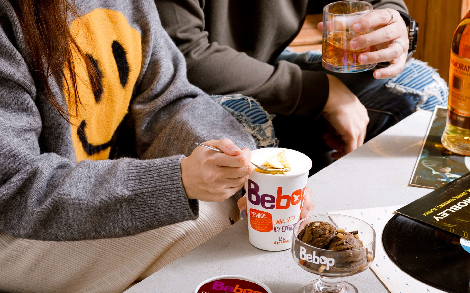
Bebop情境圖
Bebop情境圖
Curating a new type of ice cream, hip, cool and guilt-free.
In Bebop we were able to combine two passions (Ice Cream and Jazz) together and have some fun with it. Taking the free, personal expression values inherent in Jazz, and infusing this vibe into a new small batch ice cream made with food ingredients. Making something that is fun and hip, and at the same time, really tasty.
很開心可以透過Bebop這個品牌,將我們熱愛的兩種東西,「爵士樂」與「冰淇淋」融合在一起創造一個品牌,使用Bebop爵士樂時期的精神,去傳遞這個品牌想讓冰淇淋更純、好玩、自由。讓這個冰淇淋品牌有一種很好玩、活潑、美式的一種精神。因為我們的創意總監David也是Bebop的聯合創辦人與創意總監,享受可以透過這個品牌的溝通也去實驗一些食品產品做溝通時的一些可能性。